
Create a Component-based Design System in Drupal with Acquia Site Studio

Component-based design systems have evolved quickly over the past few years. They’re now considered by designers, developers, product owners and project managers as the most effective way to develop and manage design, especially at scale. In this article, I’m going to show you how a component-based design system can be implemented within Drupal using Acquia Site Studio.
What is component-based design?
There are many names used for component-based design including pattern library, design system, living style guide and atomic design. Whatever you call it, the idea is rather than designing page by page, you break a design down into smaller component parts. Individually these can be quite simple, but when combined together they create something more meaningful and useful. And when combined and arranged in a different way, their meaning and use can change.
At the heart of component design is the philosophy: Create once, use many.
The advantage of component-based design systems
- Better communication through a common visual language - Component design systems allow for a shared general knowledge of the components available to designers, developers and project managers.
- Consistent design and UX - Designs, which are formed from a common set of components, create a more consistent “look and feel” and user experience.
- Speed to create new digital products - Component design systems minimize the time spent redesigning and rebuilding similar components.
Approaches to creating a component-based design system
Designers and developers are creating lots of different approaches to creating component-based design systems. It isn’t a simple task though and there are many challenges, including:
- Complexity of design
- Technical implementation
- Organizational buy-in
- Ongoing management
For large organizations that have a lot to gain, it’s worth the effort and cost. For these, extremely technical React-based implementations are often created. Some companies, like Airbnb, have even gone as far as integrating their code-based design systems with design packages like Sketch.
For organizations that don’t have the technical resources (and budgets) for building such technical systems and digital agencies who want to create component-based design systems for a broad range of clients, it’s not always possible or cost-effective to implement such solutions. This doesn’t, however, reduce the need or advantage of using them.
Creating a component-based system within Drupal using Acquia Site Studio
Acquia Site Studio provides developers and designers with a powerful set of visual UI’s within Drupal, which will allow for the creation of a component-based design system or pattern library. It also provides website editors and content creators with an intuitive interface for creating new content using the components from the library.
Some of Site Studio’s advantages are:
- Simple and fast learning curve for both developers and designers
- Rapid creation of new components, even allowing for design in the browser
- Seamless integration with Drupal
- Components can be reused across multiple websites
What can be created using Site Studio?
Acquia Site Studio allows you to create many parts of a website that can be considered conceptually as components within a design system. These are illustrated in this diagram:
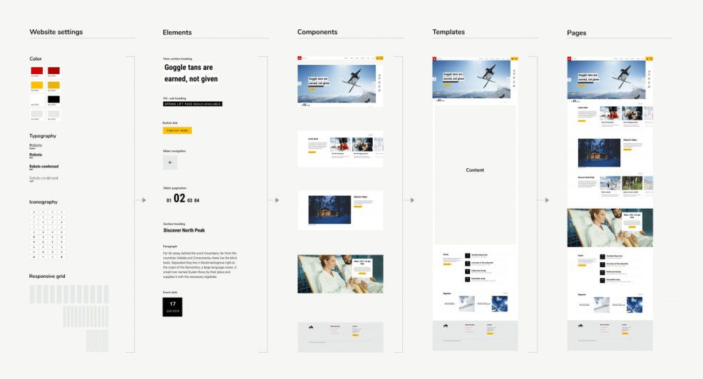
As you can see, you can configure the basic website settings (color, fonts, icons and grid), create element styles, layout and content components, templates and page layouts. All of these can be considered components of a design system but as you may have noticed, one of the columns is actually labeled “Components.” It’s these that we are going to focus on because they are the most literal in terms of component-based design.
What are components?
In functional terms, components are mini-templates that contain the layout, style, functionality and editing experience they need to be used. Technically, Site Studio components are Drupal configuration entities that when passed via API to a compiler, generate a Twig file, CSS, JS and JSON for the form settings.
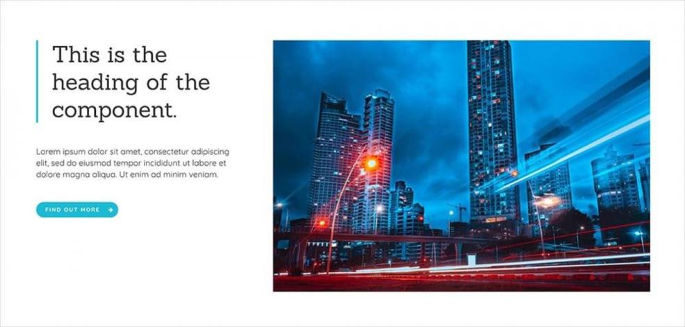
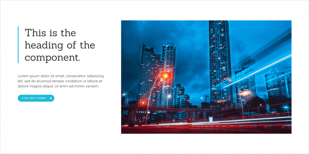
Site Studio components can be used by editors within pages to create component-based layouts and content. They can also be used by site-builders within templates to take a component-based approach to the complete website build. Below is an example of a simple page section component that would be used by a website editor. It includes a layout with two columns, a heading, a paragraph, a link and an Image.
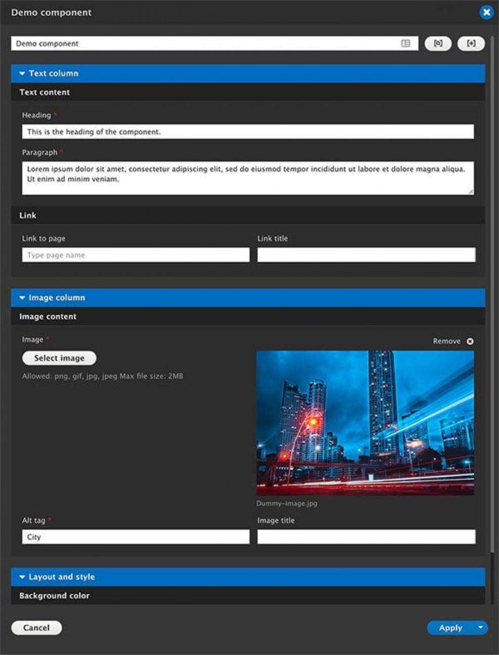
Shown below is the custom form that users of the component will use to edit its content and settings.
I’m going to walk through the process of creating a component but before I do, there are some component design principles and considerations that are useful to understand first.
Component design principles
Design lean, build early.
Designing every page of a website at multiple breakpoints and then handing it over to a developer will always lead to a costly back-and-forth exchange. Ideally, designers, developers, product owners and other stakeholders work together to define the initial list of components required.
Keep the first set of component designs to a minimum before you move to building them. You can gradually build up a library of components as you need them. This way, your learnings from building the first set can be applied when designing any further ones. It will also help to keep your library bloat-free.
It’s also a great time to involve external stakeholders. If you’re in an agency, client feedback and real-world testing with actual content can be done at this stage. The goal is to avoid large-scale redesigns.
Create once, reuse many.
This is probably the most important rule and the easiest to break. You have to be quite ruthless when managing a component design system.
Ask yourself the question, “Will creating a variant of an existing component really help the website that much that it’s worth increasing the size of your component library?” From my experience, the larger the library, the more difficult it is to manage and the larger the risk of design creep and inconsistency.
Try to be efficient with your component design. Sometimes a single component with some basic options for configuration will be more useful than five separate components.
Design in the browser.
Design systems evolve; it’s inevitable and actually desirable. You want them to keep pace with changing user requirements and expectations. If you have a large design and engineering team, you may be able to keep your design systems in sync between code and a design package like Sketch.
If this is proving too difficult or costly, then your “built” components should be the single source of truth. Evolving a component in the browser will ensure that website users are using the most up-to-date design.
Use what you’ve created.
I’ve seen design and development teams create component-based design systems and then watched designers turning back to their favorite design package to layout a new page or interface. This is a waste of time and budget in my opinion.
If you’ve created a set of components with a commonly understood naming system and knowledge of what they do, you should be able to sketch out new user interfaces on paper, whiteboards or even the back of your hand. Designers, developers and content creators should be able to create new layouts easily from the library. If they can’t, something isn’t working.
Considerations when designing components
Acquia Site Studio provides lots of options and opportunities when creating components. Although very useful, they also raise questions you should consider:
What context will the component be used in?
Are they for developers to use within templates or are they for website editors to use for page creation.
How will components be used together?
You want to ensure that when components are combined and nested, they still appear and function as desired within your design system.
What are the skills of the user of the component?
If your components are for editors, they should be easy to use. But at the same time, you want to provide them with the tools they want to create rich and engaging content. Sometimes this may include configuration options within the component that change its appearance and behavior. The skills of the component user may affect the complexity of the configuration options you offer.
What does Site Studio give you out of the box?
Acquia Site Studio includes a library of elements that you can use to create your components ranging from basic HTML elements to sophisticated interactive devices. Although you can easily extend Site Studio by developing your own elements, it's more efficient to understand and utilize what’s already available. This way, Site Studio keeps everything up-to-date and there’s less of your own bespoke code to manage.
Will a component need to be saved as a reusable content item?
Site Studio components can be used directly on the page where the content becomes part of the page. They can also be saved as individual pieces of content that can be reused across multiple pages and centrally edited. If a component will need to be saved as “Component content” then it should be formed from a single component and not include nested components.
Answers to these types of questions will help you form a specification or guidelines for component design and development. Remember, the idea is to create consistency and this comes from a systematic approach.
Example of the Site Studio component design and build process
Here are the basic steps in creating a simple component in Acquia Site Studio.
Step 1. Define the component requirements
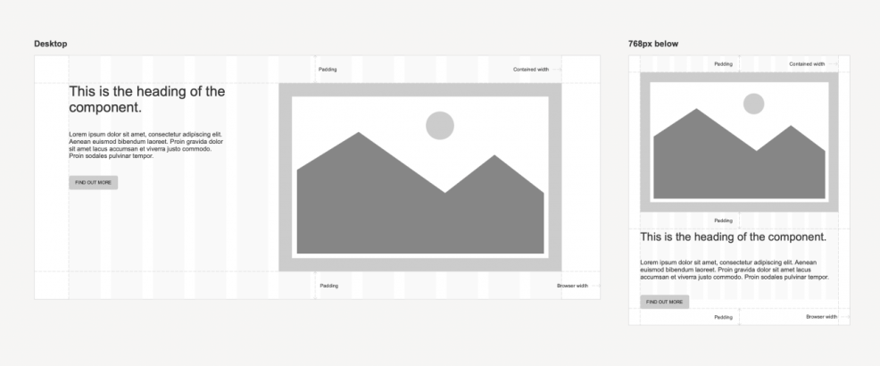
The first step is to define the component requirements. In this example, the component requirements include separate fields for each content element to keep strict control over the content being added to the component. The component layout needs to stack at resolutions below 768px.
Step 2. Design the component style and layout
This can be done in a design package like Sketch or directly in Site Studio if you want to design in the browser. Your choice depends on whether you’re designing a component for a new website where the other parts of the design system (colors, fonts, styles) aren’t in place, or adding a component to an existing website where they are. In this example, a Sketch design was produced first.
Step 3. Build the component layout
You can create the front end of the component using Site Studio’s layout builder and style builder. This should be done on a development environment rather than a production environment as you’re creating a configuration entity, not a content entity.
The easiest way to complete this step is to create the component layout directly on a Drupal content type. This way, you can preview the layout using Drupal’s node preview functionality.
It’s a good idea to add dummy content to the elements so that you can see how it will look when populated.
Step 4. Test the component layout on a page
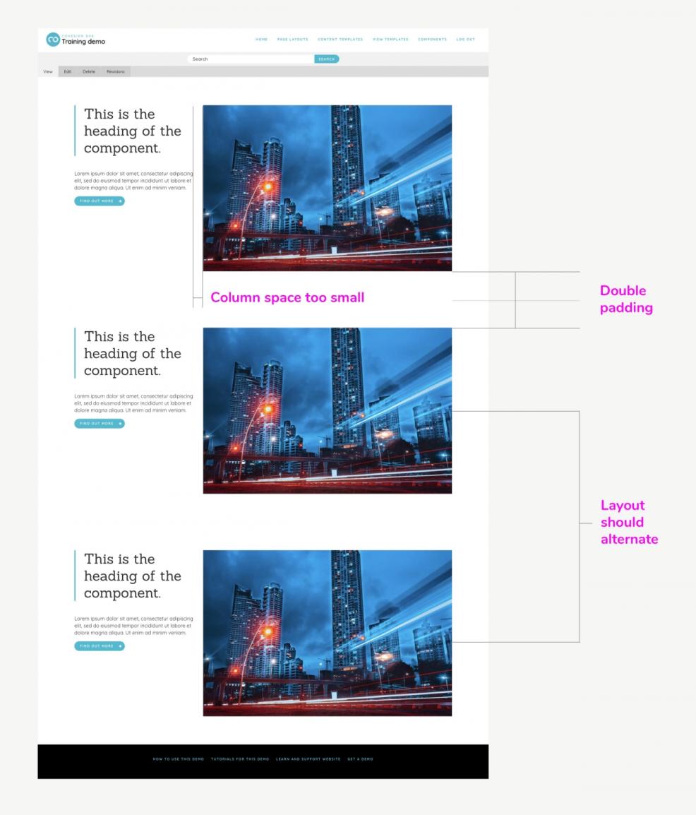
Once the static component layout has been created, you should test it. In this example, the component is a page section so it’s important that it looks correct when used along with other components. The easiest way to test this is to add some existing components to your page and place them on either side of your new component.
It’s also important that the component looks right when duplicated and stacked on top of one another. You can test this easily using Site Studio’s duplicate function on the outermost element.
After running these tests, the following issues were identified when the component was duplicated:
- The top and bottom padding is doubled up and looks incorrect.
- The space between the text and the image is too small.
- The space between the paragraph and the link is too small.
The layout would look more interesting if the image and text position alternated.
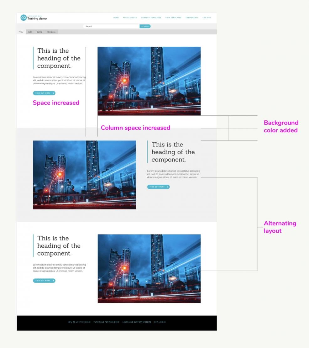
Step 5. Evolve the component layout
Once any issues with the component layout have been identified, it’s a straightforward process to modify the layout through the layout builder.
For the issues identified in this example, additional space was added between the elements and an alternating light grey background color and image position was implemented. This took about five minutes to complete. It was also decided that the background color and layout change would be a configuration option in the component so that editors had some control over its layout and style.
Step 6. Save the layout as a component, build the editing form, and test it on a page
Once the component layout is complete, you can save it as a component by simply clicking “Save as component” on the outermost element of the layout. This will create a new component config entity. You can then switch to the component builder to create the editing form and bind the form fields to the elements in the layout.
In this example, the fields we added to the editing form for the content were: heading, paragraph, link label, link, image, image alt and image title. We included default content and validation on the fields so that when the component is used on a page, it renders straight away without the need for adding content. This helps the website editor to construct their page layout quickly before editing the text and images.
We also added a select (drop-down) field that will allow the editor to choose the position of the image and another select that will allow them to choose a color theme for the component.
Once the component is complete, it can be tested by adding it to a page alongside other components and testing the editing form to ensure all the content is being rendered as expected.
Step 7. Deploy the component to your staging or production environment
The component created is a configuration entity so it can be deployed as configuration. This can be achieved in the same way as you deploy other configurations like content types and views. If the component includes file dependencies (e.g. images), you can use Site Studio’s package synchronization system, Site Studio Sync. Site Studio Sync works in the same way as Drupal’s configuration export except that it looks for all the dependencies a Site Studio configuration has (including files) and adds them to a package that can be deployed to your staging or production environment. This feature is available via the command line (drush) and through the UI.
You also have the option when using Site Studio Sync to select exactly which configuration entities you want to deploy rather than deploying all of them. In this example, we decided to only deploy our new component and the CSS styles it relies on via the UI.
Creating a reusable component library to use across multiple projects.
Once you’ve created a component (or template, style or website setting) it’s possible to export it from one website and import it into another using Site Studio Sync.
When you export a component, it will take with it any styles, fonts, colors, and other assets it has a dependency on and create a package file (.yml) that can be imported into another website. Using this technology, you can create a component-based Drupal website that acts as a living design system. From this, you can export components and import then into your other projects as and when you need them.
Keep reading to learn more about Acquia Site Studio.

